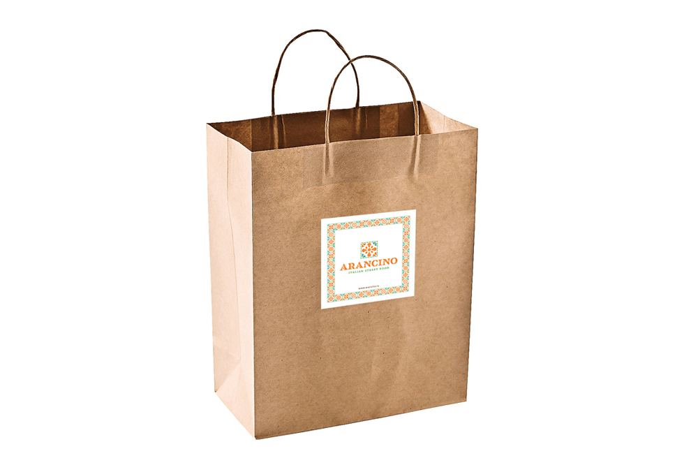
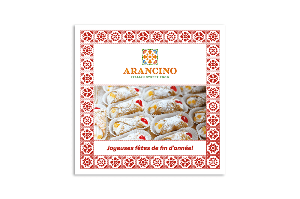
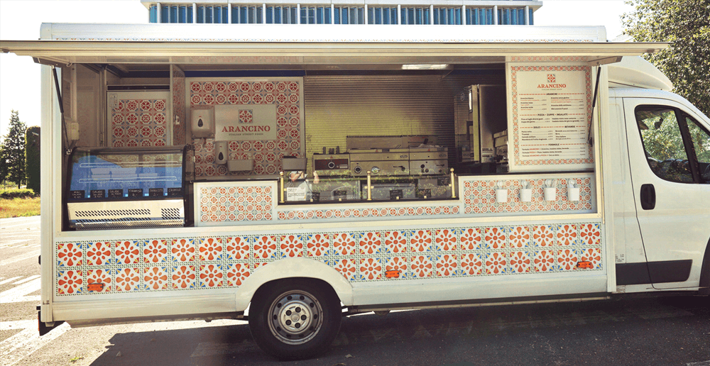
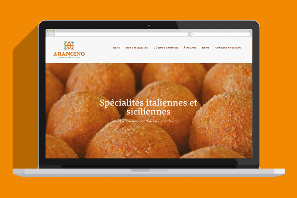
Arancino is a brand that sells Italian and Sicilian street food on a food truck in Luxembourg. In order to do a good food truck branding we decided to focus on the product they sell due also to the Sicilian name of the company.
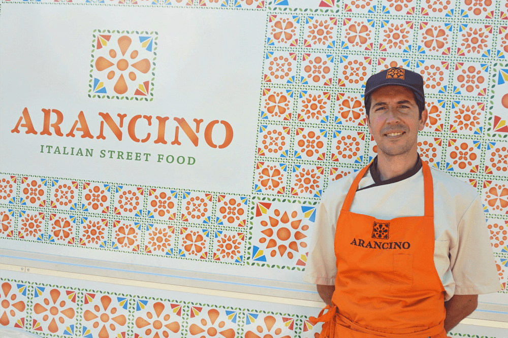
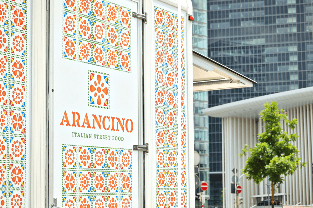
To design the logo we’ve got inspired by the Italian majolica combined with the three forms of the arancini. As a result creates a symmetrical floral illustration also combined with decorative elements of the Sicilian popular art tradition.
The leaf frame around it, wants to remember the natural products as well as their biological origin. The square shape symbolizes a window that opens to this wonderful gastronomy world.
The orange gradient recreates the classic volume and fried texture of arancini‘s, the stencil typeface wants to be a recall to street food.
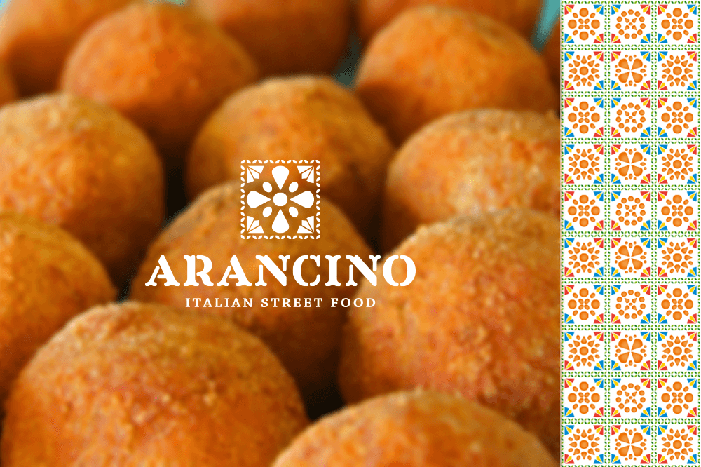
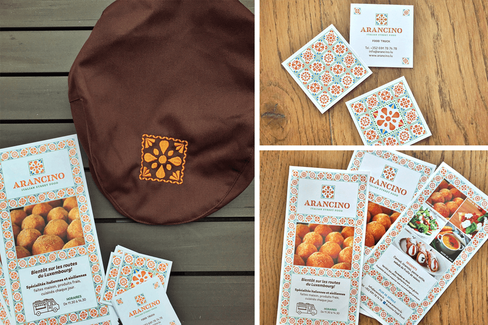
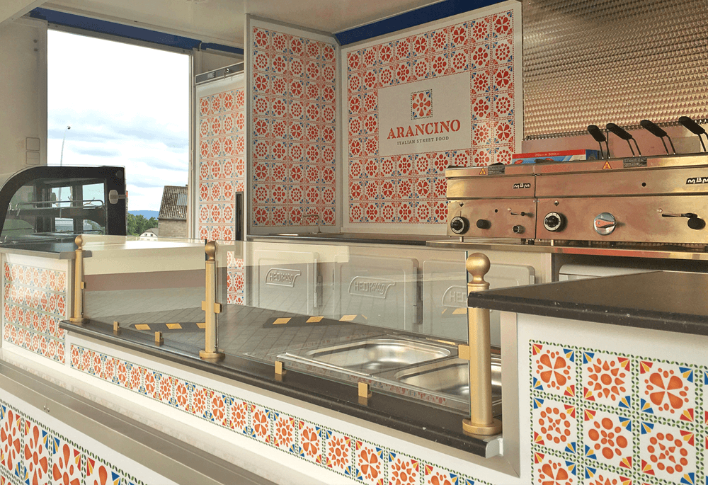
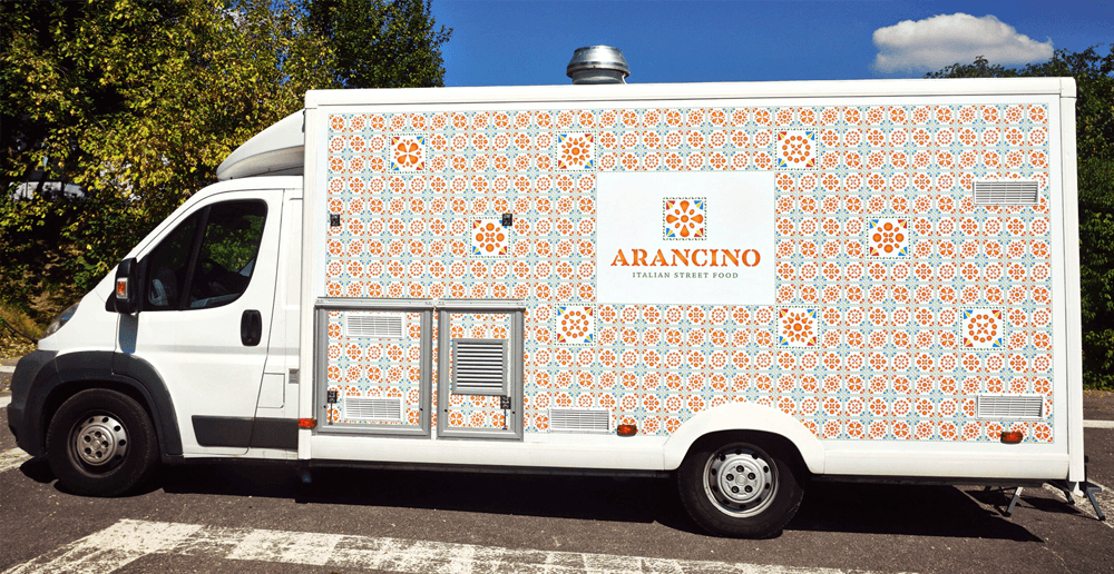
The logo is supported by a graphic system created with a pattern. This pattern is formed by other tiles designed with different combination of arancini’s sizes that create floral and geometrical compositions.
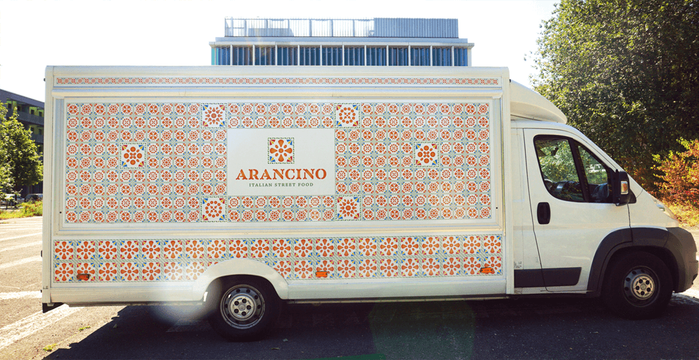
So, do to the fact that we wanted the food truck to generate immediate visual impact in the parking lots, the covering has been decorated with the pattern. The tiles appear in different sizes in order to create visual movement. As a result the food truck transmits perfectly the southern Italy concept and invites all the people who see it to stop by and enjoy its delicious products.
